This course will help you get started with Seaborn by walking through the structure of its library, showing how to create key charts in Seaborn, and comparing the results with equivalent plots created with Matplotlib.
Seaborn is a Python data visualization library based on matplotlib. It provides beautiful default styles and color palettes to make statistical plots more attractive. It is built on the top of matplotlib library and also closely integrated to the data structures from pandas.
In this course, I will guide you through an overview of different plots available in Seaborn.
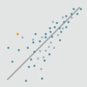
We will go over three different families of plots built into Seaborn: relational, distribution, and categorical plots. Relational plots are used for highlighting the relationship between two variables.
In Seaborn, these are scatter plots and line plots. Distribution plots make it easy to see the shape of a data set, and help understand how its values are distributed.
Seaborn aims to make visualization the central part of exploring and understanding data. It provides dataset–oriented APIs, so that we can switch between different visual representations for same variables for better understanding of dataset.
This course takes a detailed look at this library in the Seaborn.
Data visualization has been one of the most important driving forces in the field of Data Analytics. It powers millions of businesses across the globe and provides in–depth insights into the data at hand. This makes it vital that you know about the latest and the most popular data visualization libraries out there: Seaborn in Python is one of these.
Specification: Fundamentals of Seaborn
|
User Reviews
Be the first to review “Fundamentals of Seaborn” Cancel reply
This site uses Akismet to reduce spam. Learn how your comment data is processed.

| Price | $14.99 |
|---|---|
| Provider | |
| Duration | 1 hour |
| Year | 2022 |
| Level | All |
| Language | English ... |
| Certificate | Yes |
| Quizzes | No |


There are no reviews yet.