
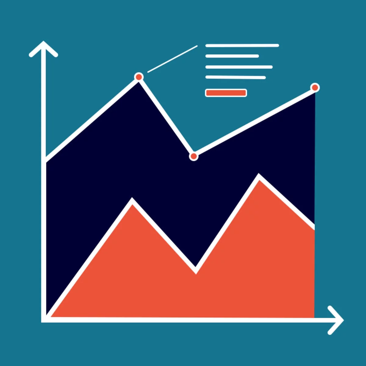
While telling stories with data has been part of the news practice since its earliest days, it is in the midst of a renaissance. Graphics desks which used to be deemed as “the art department,” a subfield outside the work of newsrooms, are becoming a core part of newsrooms’ operation. Those people (they often have various titles: data journalists, news artists, graphic reporters, developers, etc.) who design news graphics are expected to be full–fledged journalists and work closely with reporters and editors. The purpose of this class is to learn how to think about the visual presentation of data, how and why it works, and how to doit the right way. We will learn how to make graphs like The New York Times, Vox, Pew, and FiveThirtyEight. In the end, you can share–embed your beautiful charts in publications, blog posts, and websites. This course assumes you understand basic coding skills, preferably Python. However, we also provide a brief review on Python in Module 1, in case you want to refresh yourself on the basics and perform simple data analysis. The University of Illinois at Urbana–Champaign is a world leader in research, teaching and public engagement, distinguished by the breadth of its programs, …
Instructor Details
Courses : 1
Specification: Visualization for Data Journalism
|
1 review for Visualization for Data Journalism
Add a review Cancel reply
This site uses Akismet to reduce spam. Learn how your comment data is processed.
| Price | Free |
|---|---|
| Provider | |
| Duration | 18 hours |
| Year | 2019 |
| Level | Beginner |
| Language | English |
| Certificate | Yes |
| Quizzes | Yes |

FREE



Harold H –
Thanks very much for great content and the instructor did a great job, and her materials were very use helpful and relevant! Great experience!