
Do you want to learn how to create a rich variety of graphs and charts?
Do you wish you had superior data interpretation skills?
Does your workplace require data visualization proficiency?
Yes, yes, and most likely yes.
The Complete Data Visualization Course is here for you with TEMPLATES for all the common types of charts and graphs in Excel, Tableau, Python, and R!
These are 4 different data visualization courses in 1 course!
Whether your preferred environment is Excel, Tableau, Python, or R, this course will enable you to start creating beautiful data visualizations in no time!
You will not only learn how to create charts, but also how to label them, style them, and interpret them. Moreover, you will receive immediate access to all templates we work with in the lessons. Simply download the course files, replace the dataset, and amaze your audience!
Graphs and charts included in The Complete Data Visualization Course:
Bar chart
Pie chart
Stacked area chart
Line chart
Histogram
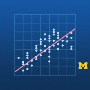
Scatter plot
Scatter plot with a trendline (regression plot)
We live in the age of data. And being able to gather good data, preprocess it, and model it is crucial.
However, there is nothing more important than being able to interpret that data. And data visualization allows us to achieve just that.
Instructor Details
Courses : 7
Specification: The Data Visualization Course: Excel, Tableau, Python, R
|
16 reviews for The Data Visualization Course: Excel, Tableau, Python, R
Add a review

| Price | $11.99 |
|---|---|
| Provider | |
| Duration | 9 hours |
| Year | 2022 |
| Level | All |
| Language | English ... |
| Certificate | Yes |
| Quizzes | Yes |

$11.99

Razak Saka –
Yes
John Moscrop –
so far its ok . Just listening to a cartoon lady…?
Mujeeb Rahman –
It’s so intuitive and well presented! It hooks the audience to it. Great job!
Lennox Timm –
Add lots of richness to presentations
Eric Ndau –
so far so good, content is really complimenting my knowledge gaps
Paul C. Ekezie –
Awesome!
Filma Chansing –
Great so far
Naga Rajan –
Excellent visuals (cartoons!) and very good explanation. Good energy. Well motivated. Good Course! Would I recommend this to a friend? Yes. I would certainly!
Dean Altstaetter –
The presentation was clear and visually pleasing. It seems a little rudimentary but I m waiting to learn more from advanced lessons
Dan Glenboski –
Using four different programs to create the Data Visualization charts was extremely valuable. I was aware of only two programs (Excel & Python) before I studied the course. I only wish that there was a more detailed reference pdf of the course. It would be helpful when reviewing the material. It’s too time consuming to scan the videos for information.
Christine Shearer –
Pleased with this course. Now have the instructions/script to make basic plots in four different programs. The course also offers tips and resources on how to make effective plots. I think the cartoon female teacher is a nice change of pace from the usual kind of teaching on this site. One quibble is that I’ve come across some tiny errors in the Python scripts.
Franz Otalora –
The excel guide can be applied also in Google Spreadsheets
Muhannad Fallata –
the content was presented in a memorable way
Anil Kumar Pillai –
Its a good course very well designed with hands on practice. If examples of creating dashboards and storyboard in tableau were also incorporated then it would have been like an icing on the cake. Excellent explanation and presentation by the instructor.
Michel Schweinsberg –
It would be hard to find a better introduction to Data Visualzation with the leading visualziation tools. Instead of having to piece together a bunch of youtubes, or even several other Udemy Courses, you get 4 major pieces of software, and step by step how to create all the basic charts in each of them. Absolutely superb!! WHEEE! I have 4.5 out of 5 starts, and I want to say the course is VERY good. Excellent. I reserved saying it was perfect however because I would have absolutely and utterly loved to see them include Javascript D3 in each section too. That is my favorite and I think offers the most beautiful possibilities. Nevertheless, you get a great introduction to 4 big players here, and that is worth a lot.
Md. Saklain jawed –
Awesome